Ever wondered why some dishes instantly look more appetizing than others, even before the first bite? If you’re here, you’re likely curious about how flavors, presentation, and creativity come together to elevate everyday cooking. This article explores the connection between color and food perception, global flavor foundations, and inventive fusion ideas you can bring straight into your kitchen.
We break down how visual cues influence taste expectations, why certain flavor pairings work across cultures, and how small preparation tweaks can transform a simple meal into something memorable. Backed by culinary research, sensory studies, and hands-on kitchen experimentation, the insights shared here are grounded in both science and practical experience.
Whether you’re experimenting with bold new combinations or refining your prep techniques, you’ll find clear, actionable guidance designed to help you cook with more confidence, creativity, and flavor awareness from the very first step.
Why We Eat With Our Eyes First
In exploring how color can dramatically alter our perception of flavor, it’s fascinating to consider how these visual cues intertwine with the compelling combinations in our next article on Sweet and Savory Flavor Pairings That Actually Work.
Before flavor hits your tongue, your brain has already made a decision. Scientists call this crossmodal perception—the way one sense shapes another. In studies, diners rated identical drinks as sweeter when dyed red (even when the sugar never changed). That’s color and food perception in action. Competitors stop there. We go further. Plate contrast, cultural color cues, and lighting temperature all recalibrate expectation before the first bite. Bright herbs against neutral plates pop, boosting perceived freshness. Blue lighting can mute appetite; warm amber can amplify comfort (think cozy café scenes). Test and taste.
The Unspoken Language of Food Color
Primal instincts still shape every bite we take. Through evolution, our brains learned to read color as a survival code: green meant safe leaves, red signaled ripe fruit, and brown hinted at cooked, energy-rich food. I once ignored that wiring. In an early kitchen experiment, I served a blue mashed potato dish at a tasting. It was buttery and perfectly seasoned, yet guests hesitated. Some even said it “tasted” off. In reality, nothing was wrong except the hue. That failure taught me how deeply expectation drives flavor.
Use color and food perception in the section once exactly as it is given may sound technical, but it captures the lesson: our eyes eat first. Moreover, common color associations steer anticipation. Red suggests sweetness and ripeness, like strawberries or cherries. Green whispers freshness or tartness—think limes and herbs. Yellow and orange promise citrus brightness and warmth. Blue and purple feel rare and earthy, from blueberries to eggplant. Meanwhile, white and brown anchor us with savory comfort: bread, potatoes, mushrooms. However, when we ignore these signals, dishes confuse instead of delighting. The lesson is simple: respect the palette, then innovate carefully. Pro tip: test bold colors gradually.
Before you take a bite, your brain already has. This is the Expectation Effect—your mind quietly “pre-tastes” food based on sight alone. A strawberry mousse glowing ruby-red seems richer and sweeter than the same mousse dyed pale pink. The color primes your taste buds like a movie trailer hinting at the blockbuster flavor to come.
Consider the famous wine experiment. Researchers tinted white wine with odorless red dye and served it to seasoned tasters. Swirling the glass, inhaling berry aromas that weren’t there, they described notes of cherry, plum, even leather. In reality, it was standard white wine. The deep garnet hue overrode years of training.
Furthermore, color shapes how filling or sweet something feels. In studies on color and food perception, participants rated a blush-pink yogurt as sweeter than an identical white version. The creamy texture hasn’t changed, yet the rosy tint whispers sugar. As a result, people may assume higher calories and feel fuller sooner.
However, when color and flavor clash, the illusion shatters. Imagine lifting a glass of neon-green liquid, expecting lime, and tasting bright orange instead. Your tongue registers citrus, but your eyes protest. That split second of confusion can dull enjoyment or even make the drink seem artificial. Why does a simple shade hold so much power?
Because eating is a full-sensory performance, where sight sets the stage before aroma and taste deliver their lines beautifully. Change the lighting or the dye, and you quietly rewrite the script your palate follows with surprising emotional force.
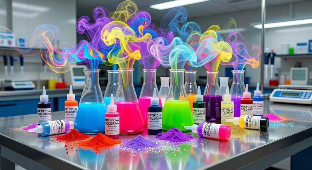
Beyond Natural Hues: The Role of Artificial Coloring
First, let’s be honest: if your favorite cheese puffs showed up pale beige tomorrow, you’d assume something went terribly wrong. Consistency is why manufacturers rely on artificial colors. Shoppers expect the same bright orange crunch in every bag, every time. Brands know that visual uniformity builds trust (even if it’s a little theatrical). Studies show that consistent appearance increases perceived quality and brand reliability (Journal of Consumer Research, 2014).
Then there’s flavor signaling. In processed foods—think neon gummy bears or electric-blue sports drinks—color does the heavy lifting. Without it, cherry might look identical to watermelon. Artificial dyes act like edible road signs, telling your brain what to expect before the first bite. This tight link between color and food perception shapes taste expectations dramatically (Spence, 2015).
Now, here’s my take: the wildest hues aren’t about flavor at all. They’re about fun. Bright, unnatural colors dominate cereals and candies because kids equate vibrancy with excitement. It’s less “strawberry field” and more Saturday morning cartoon energy. Sure, some argue natural colors could do the job. Maybe. But muted tones don’t exactly scream party.
Interestingly, if you explore the cultural history behind popular comfort foods, you’ll notice many classics relied on natural tones—proof that fun once tasted different.
Harnessing Color in Your Own Kitchen
First, plate with intention. Start with a neutral plate—white or black works well—then apply the rule of three: choose three distinct colors to create balance. For example, grilled salmon (coral), steamed broccolini (green), and lemon couscous (yellow) look vibrant. If your food is pale, switch to a darker plate for contrast. Conversely, rich stews pop on white. (Yes, we do eat with our eyes first.)
Next, skip artificial dyes. Use turmeric for golden rice, beet juice for pink pasta, spirulina for blue smoothie bowls, and activated charcoal for black buns. These natural pigments add subtle flavor and visual intrigue.
Finally, try this home experiment. Divide vanilla pudding into three bowls: keep one white, tint one pink with beet juice, and mix cocoa into the third. Taste each. Notice how expectations shift. That’s color and food perception in action—and now you can use it deliberately.
Color isn’t decoration; it’s expectation. “We taste with our eyes first,” a chef once told me, sliding a crimson beet salad across the counter. I laughed, then paused after one bite. He was right. The brightness promised freshness, and my brain delivered it. That’s color and food perception at work. When a friend whispered, “Why does this look sweeter?” she wasn’t joking. OUR BRAINS connect sight to flavor before a fork lifts. Some argue taste alone matters. But if that were true, why plate with care? Tonight, pause and ask: what are these hues telling me? Notice, then savor deeply.
Bring More Flavor to Your Table
You came here looking for fresh culinary buzz, global flavor basics, and creative fusion meal ideas—and now you have the inspiration to experiment with confidence. From smart kitchen prep tips to bold Toaf taste experiments, you’ve seen how small shifts in color and texture can completely transform food perception and elevate everyday meals.
If you’ve ever felt stuck making the same dishes on repeat, that frustration ends here. Understanding how color influences food perception gives you a powerful, practical way to make your cooking more exciting, more vibrant, and more satisfying.
Now it’s time to act. Pick one new fusion idea, experiment with a different color contrast, and apply a prep technique you learned today. Don’t just read about flavor—create it.
For more chef-inspired ideas, trending flavor combinations, and proven kitchen strategies trusted by passionate home cooks worldwide, explore more of our culinary guides now and start turning every meal into a standout experience.